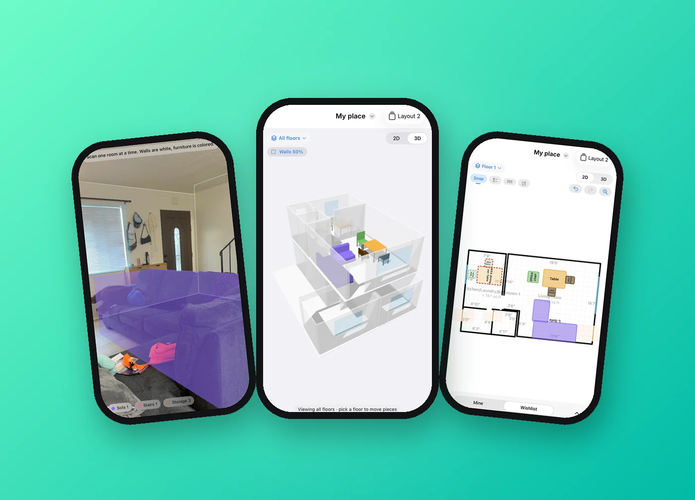
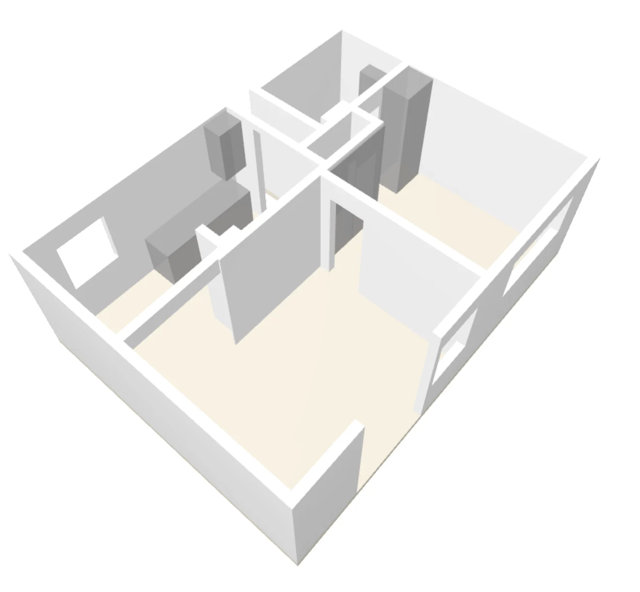
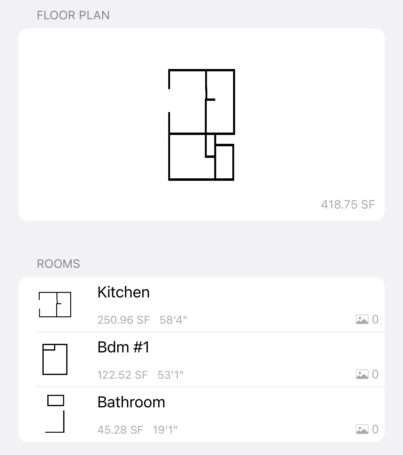
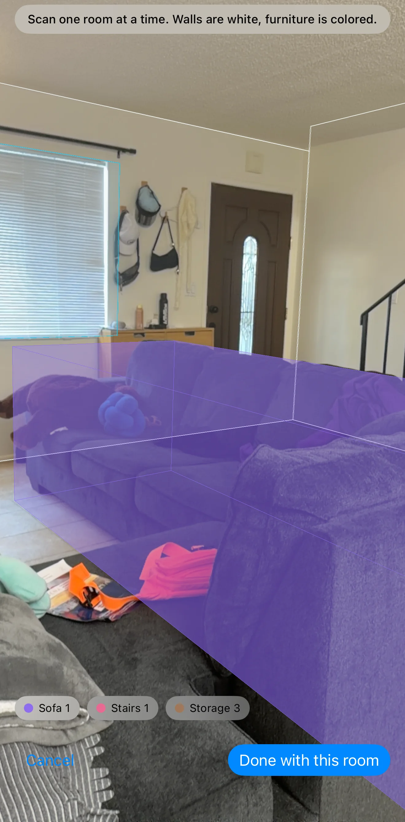
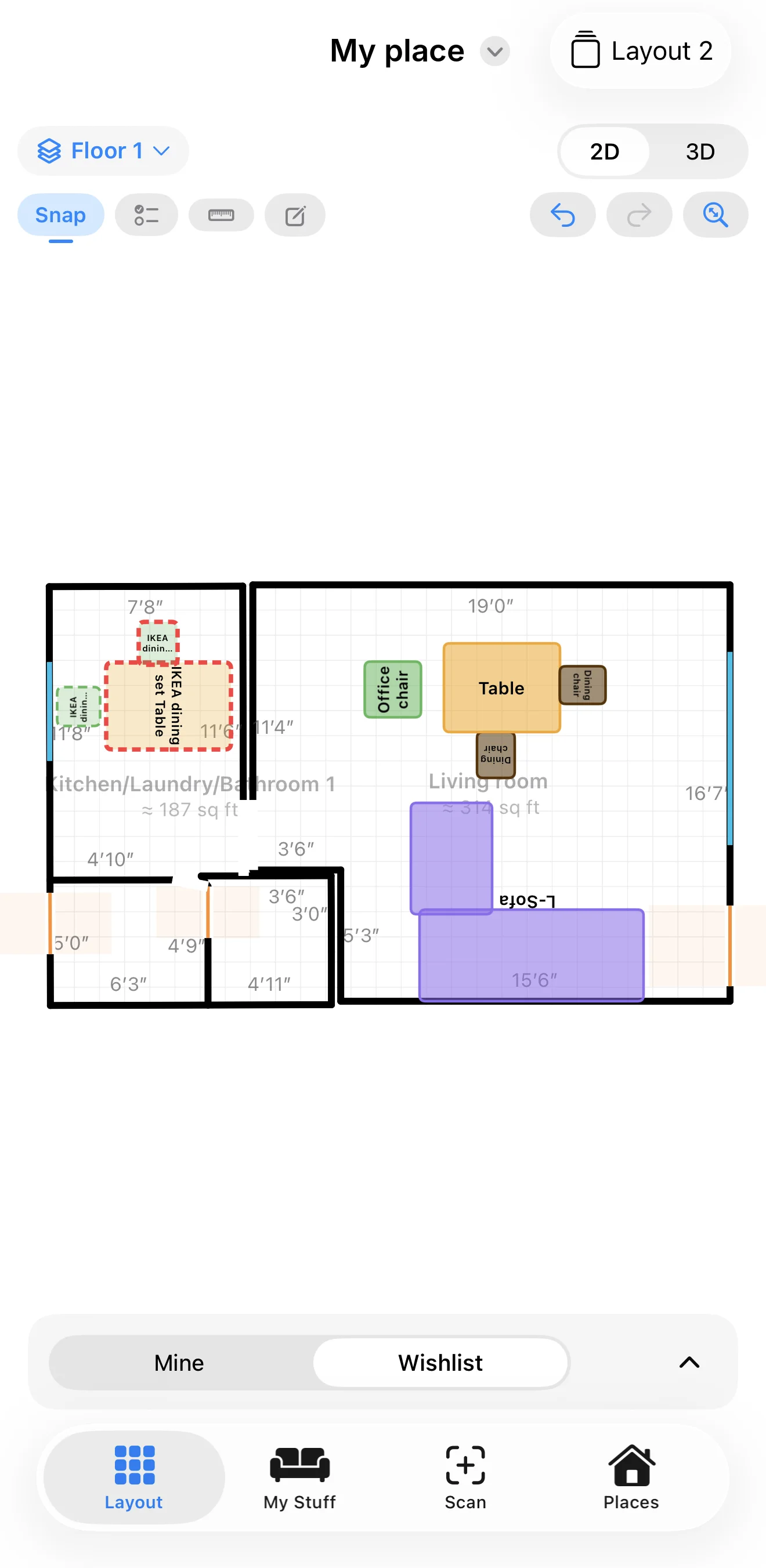
Claude wrote the code. Deciding what to build, and how it should feel, was my job. These came from using it in real places.
First launch
Scan first, name it later
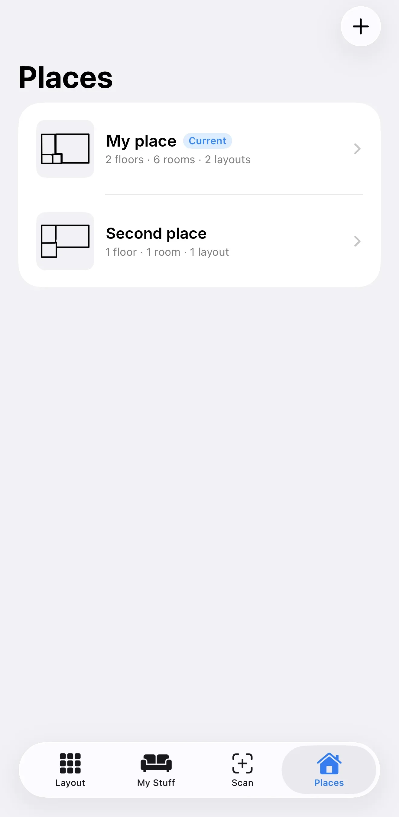
“I don’t want property to be the first thing they see.” The app opens straight into scanning; the place gets a name only when you finish a floor.
Why: setup screens stand between you and the one thing you came to do.
Planning IKEA trips
A Scan button in the tab bar
Scanning happens out in the world; planning happens on the couch. So Scan got its own tab with just two choices: a place or furniture.
Why: in a showroom aisle you need one tap, not a menu inside a layout screen.
IKEA showroom
Whose furniture is it?
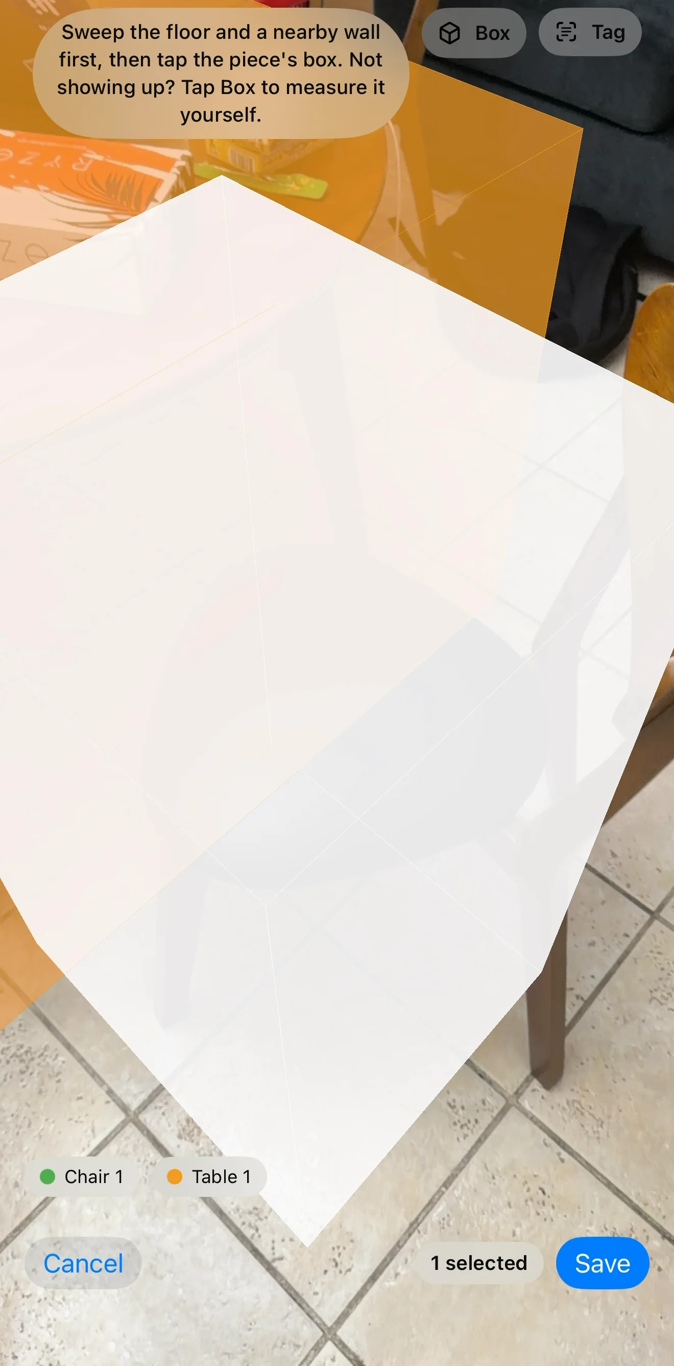
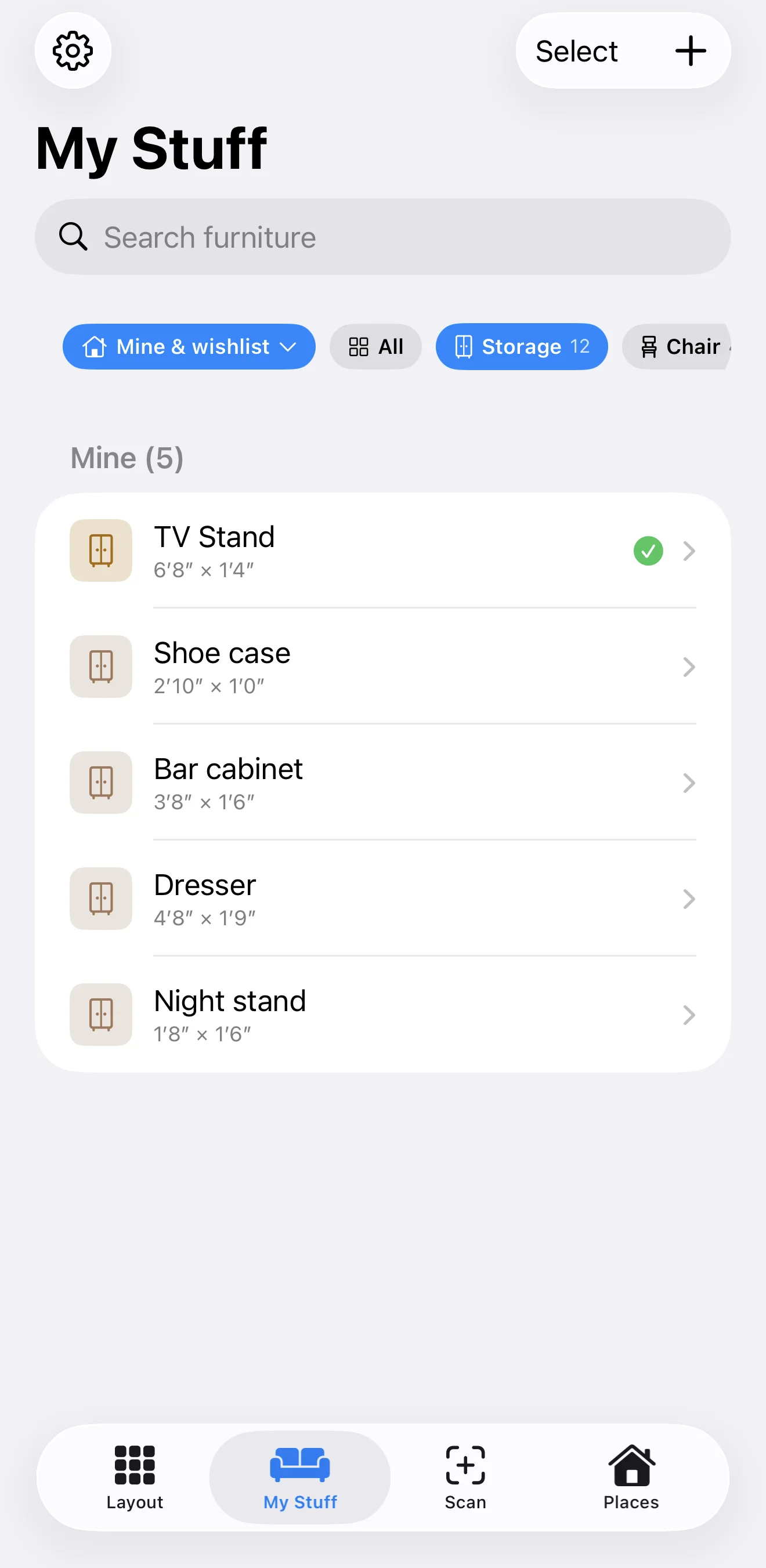
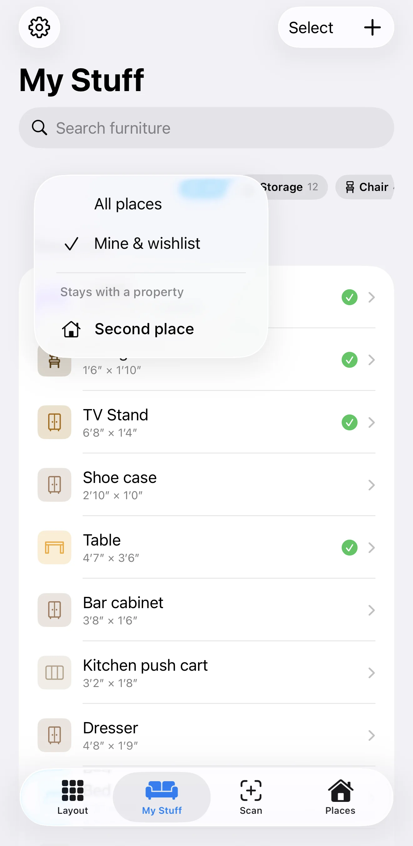
A showroom scan isn’t my stuff. Every save asks Me / Wishlist / The property, and remembers the last answer for a run of showroom scans.
Why: the same scanner serves my home, a store and a rental.
Planning a small place
Warn, don’t block
Placing more than you own shows a yellow “3 placed · you have 2”, like the “Tight walkway” note. Drag a piece onto the trash bar to remove it, no confirmation; Undo brings it back.
Why: planning is trial and error. Friction belongs on real data loss, not on experiments.
Inspired by The Sims
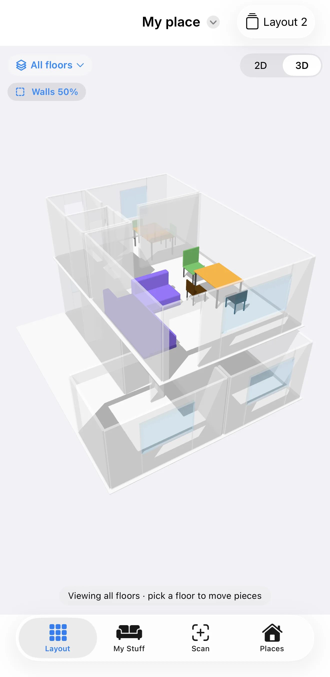
Move furniture in 3D
Only the selected piece drags; anywhere else orbits the camera. Walls fade while you drag so pieces can’t hide, and snapping works live.
Why: one rule ends “did I move the sofa or the camera?”
Caught reading my own UI
Say what actually happens
“Add to My Stuff only” read as if the floor plan wouldn’t be saved. I reframed the options as a question about the furniture, with a note that the floor plan is always kept.
Why: a label that sounds like data loss stops people from scanning.